扫码一下
查看教程更方便
bootstrap4 卡片是一种灵活且可扩展的内容容器。 它包括页眉和页脚选项、种类繁多的内容、上下文背景颜色和强大的显示选项。 card 替换了旧的 bootstrap 3 版本中的面板、缩略图组件。
在以下部分中,我们将看到可以使用卡片组件执行哪些操作。
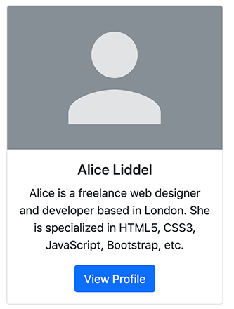
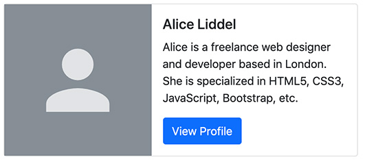
卡片标记非常简单。 外部包装器需要基类 .card,而内容可以放置在 .card-body 元素内。 下面的示例将展示如何创建带有图片、混合了一些文本内容和按钮的卡片。
        alice liddel
        alice is a freelance web designer and developer based in london. she is specialized in html5, css3, javascript, bootstrap, etc.
上面示例创建的卡片效果如下
注意:卡片没有固定的宽度,它们会占据其父元素的整个宽度。 所以,如果你需要一个固定宽度的卡片,你需要自己在卡片上应用 width 属性。 此外,卡片默认没有边距,如果需要,请使用 margin 实用程序类。
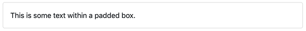
无论何时当我们需要创建一个填充框时,都可以简单地在 .card 元素中放置 .card-body 来实现。
显示的效果如下
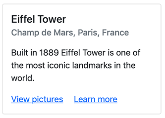
我们还可以在卡片内放置标题和链接以及文本,如下所示:
        eiffel tower
        champ de mars, paris, france
        built in 1889 eiffel tower is one of the most iconic landmarks in the world.
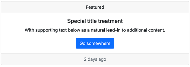
还可以分别使用.card-header和.card-footer类在卡片中添加页眉和页脚。让我们看一下下面的例子:
a well-known quote, contained in a blockquote element.
显示效果如下
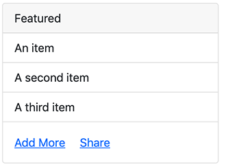
还可以将列表组与其他内容类型一起放在卡片中,如下所示。
- an item
- a second item
- a third item
上面示例的输出将如下所示:
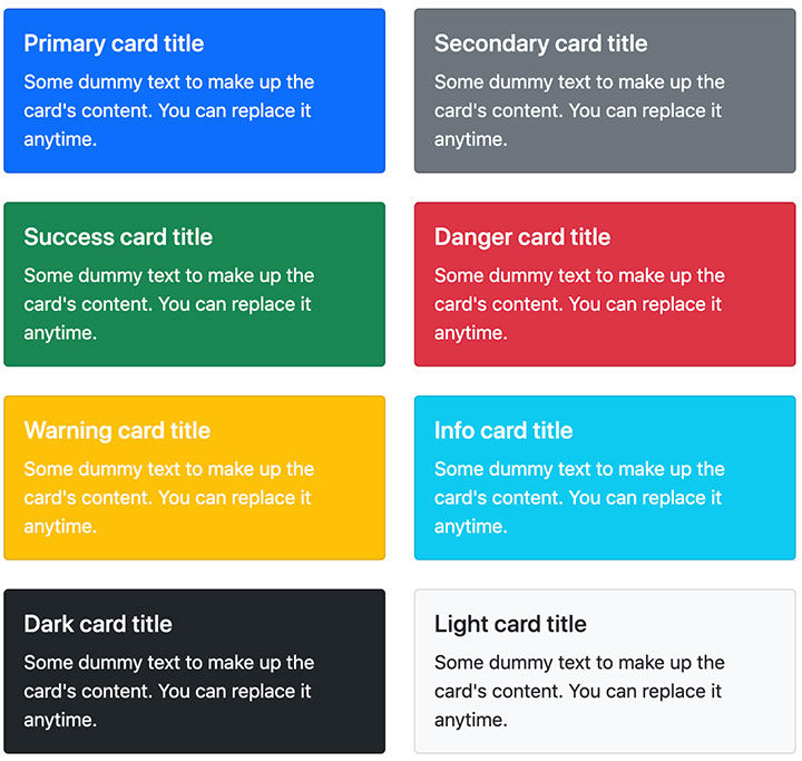
我们可以简单地使用背景和颜色实用程序类来更改卡片的样式。 让我们尝试以下示例来了解它的基本工作原理:
                primary card title
                some dummy text to make up the card's content. you can replace it anytime.


                secondary card title
                some dummy text to make up the card's content. you can replace it anytime.


                success card title
                some dummy text to make up the card's content. you can replace it anytime.


                danger card title
                some dummy text to make up the card's content. you can replace it anytime.


                warning card title
                some dummy text to make up the card's content. you can replace it anytime.


                info card title
                some dummy text to make up the card's content. you can replace it anytime.


                dark card title
                some dummy text to make up the card's content. you can replace it anytime.


                light card title
                some dummy text to make up the card's content. you can replace it anytime.
显示效果如下
除了卡片的样式之外,bootstrap 还包括一些用于布局卡片的选项。但是,这些布局还没有响应式的。
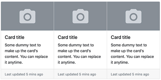
可以使用卡片组将卡片呈现为具有相等宽度和高度列的单个附加元素。 但是,卡片组中的卡片会在超小型设备上水平堆叠(即视口宽度 <576 像素)。 让我们尝试一个例子,看看它是如何工作的:
card title
some dummy text to make up the card's content. you can replace it anytime.
card title
some dummy text to make up the card's content. you can replace it anytime.
card title
some dummy text to make up the card's content. you can replace it anytime.
显示效果如下
还可以使用网格和实用程序类的组合来创建水平卡片,其中图像和文本内容并排放置,如以下示例所示:
                alice liddel
                alice is a freelance web designer and developer based in london. she is specialized in html5, css3, javascript, bootstrap, etc.
显示效果如下
我们可以使用文本对齐实用程序类轻松更改任何卡片的文本对齐方式(全部或特定部分)。 例如,可以使用类 .text-center 和 .text-end 将卡片的文本内容分别与中心和右端对齐。
                card title
                some dummy text to make up the card's content. you can replace it anytime.


                card title
                some dummy text to make up the card's content. you can replace it anytime.


                card title
                some dummy text to make up the card's content. you can replace it anytime.
点击尝试一下查看效果
可以将类 .stretched-link 添加到卡片内的链接中,以使整个卡片可点击(即整个卡片就像一个链接)。 不建议给多个链接使用拉伸链接。
试试下面的例子,看看实际上是如何工作的:
        alice liddel
        alice is a freelance web designer and developer based in london. she is specialized in html5, css3, javascript, bootstrap, etc.