扫码一下
查看教程更方便
警报框经常用于突出需要最终用户立即注意的信息,例如警告、错误或确认消息。
使用 bootstrap,我们可以通过将上下文类(例如,.alert-success、.alert-warning、.alert-info 等)添加到 .alert 基类,轻松地为各种目的创建优雅的警报消息。 您还可以添加一个可选的关闭按钮来关闭任何警报。
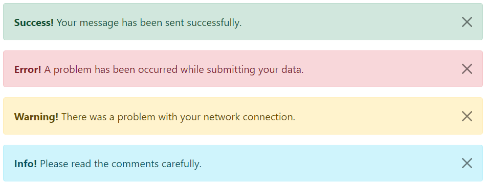
bootstrap 提供总共 8 种不同类型的警报。 以下示例将向您展示最常用的警报,它们是:success、error或danger、warning和 info 警报。
上述代码结果如下所示
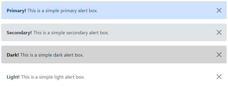
以下是可用于各种目的的其余四个 bootstrap 警报。
上面示例显示结果如下
提示: .alert 元素上的 .fade 和 .show 类在关闭警报框时启用淡入淡出过渡效果。 如果您不想要动画,只需删除这些类。 此外,为了正确定位 .btn-close,.alert 元素需要类 .alert-dismissible。 如果您的警报没有关闭按钮,您可以跳过该课程。
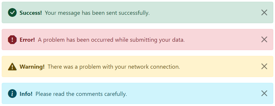
我们还可以在 bootstrap 警报中放置图标。 可以使用 bootstrap 图标或第三方图标,例如 font awesome。 让我们看一下下面的例子:
上面示例的结果如下所示
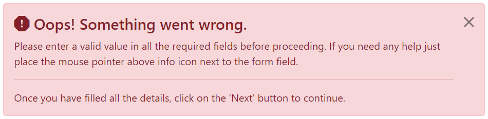
我们还可以在警报中放置其他 html 元素,例如标题、段落和分隔符。 要管理元素之间的间距,您可以使用边距实用程序类,如下所示:
     oops! something went wrong.
    please enter a valid value in all the required fields before proceeding. if you need any help just place the mouse pointer above info icon next to the form field.

    once you have filled all the details, click on the 'next' button to continue.
上面示例的结果如下
您可以将实用程序类 .alert-link 应用于任何警报框内的链接,以快速创建匹配的彩色链接,如下例所示:
上面示例显示结果如下

data 属性提供了一种向警报框添加关闭功能的简单方法。
只需将 data-bs-dismiss="alert" 添加到关闭按钮,它将自动启用包含警报消息框的关闭。 此外,将类 .alert-dismissible 添加到 .alert 元素以正确定位 .btn-close 按钮。
使用