扫码一下
查看教程更方便
echarts 使用 dataset 管理数据。
dataset 组件用于单独的数据集声明,从而数据可以单独管理,被多个组件复用,并且可以基于数据指定数据到视觉的映射。
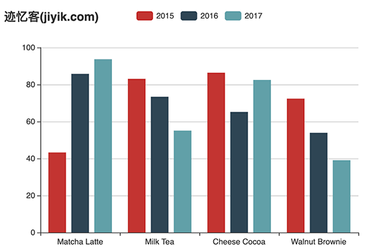
下面是一个最简单的 dataset 的例子:
option = {
  title: {
                text: "迹忆客(jiyik.com)"
        },
    legend: {},
    tooltip: {},
    dataset: {
        // 提供一份数据。
        source: [
            ['product', '2015', '2016', '2017'],
            ['matcha latte', 43.3, 85.8, 93.7],
            ['milk tea', 83.1, 73.4, 55.1],
            ['cheese cocoa', 86.4, 65.2, 82.5],
            ['walnut brownie', 72.4, 53.9, 39.1]
        ]
    },
    // 声明一个 x 轴,类目轴(category)。默认情况下,类目轴对应到 dataset 第一列。
    xaxis: {type: 'category'},
    // 声明一个 y 轴,数值轴。
    yaxis: {},
    // 声明多个 bar 系列,默认情况下,每个系列会自动对应到 dataset 的每一列。
    series: [
        {type: 'bar'},
        {type: 'bar'},
        {type: 'bar'}
    ]
}
上述示例运行结果如下图所示
或者也可以使用常见的对象数组的格式:
option = {
    legend: {},
    tooltip: {},
    dataset: {
        // 这里指定了维度名的顺序,从而可以利用默认的维度到坐标轴的映射。
        // 如果不指定 dimensions,也可以通过指定 series.encode 完成映射,参见后文。
        dimensions: ['product', '2015', '2016', '2017'],
        source: [
            {product: 'matcha latte', '2015': 43.3, '2016': 85.8, '2017': 93.7},
            {product: 'milk tea', '2015': 83.1, '2016': 73.4, '2017': 55.1},
            {product: 'cheese cocoa', '2015': 86.4, '2016': 65.2, '2017': 82.5},
            {product: 'walnut brownie', '2015': 72.4, '2016': 53.9, '2017': 39.1}
        ]
    },
    xaxis: {type: 'category'},
    yaxis: {},
    series: [
        {type: 'bar'},
        {type: 'bar'},
        {type: 'bar'}
    ]
};
我们可以在配置项中将数据映射到图形中。
我们可以使用 series.serieslayoutby 属性来配置 dataset 是列(column)还是行(row)映射为图形系列(series),默认是按照列(column)来映射。
以下实例我们将通过 serieslayoutby 属性来配置数据是使用列显示还是按行显示。
option = {
    legend: {},
    tooltip: {},
    dataset: {
        source: [
            ['product', '2012', '2013', '2014', '2015'],
            ['matcha latte', 41.1, 30.4, 65.1, 53.3],
            ['milk tea', 86.5, 92.1, 85.7, 83.1],
            ['cheese cocoa', 24.1, 67.2, 79.5, 86.4]
        ]
    },
    xaxis: [
        {type: 'category', gridindex: 0},
        {type: 'category', gridindex: 1}
    ],
    yaxis: [
        {gridindex: 0},
        {gridindex: 1}
    ],
    grid: [
        {bottom: '55%'},
        {top: '55%'}
    ],
    series: [
        // 这几个系列会在第一个直角坐标系中,每个系列对应到 dataset 的每一行。
        {type: 'bar', serieslayoutby: 'row'},
        {type: 'bar', serieslayoutby: 'row'},
        {type: 'bar', serieslayoutby: 'row'},
        // 这几个系列会在第二个直角坐标系中,每个系列对应到 dataset 的每一列。
        {type: 'bar', xaxisindex: 1, yaxisindex: 1},
        {type: 'bar', xaxisindex: 1, yaxisindex: 1},
        {type: 'bar', xaxisindex: 1, yaxisindex: 1},
        {type: 'bar', xaxisindex: 1, yaxisindex: 1}
    ]
}
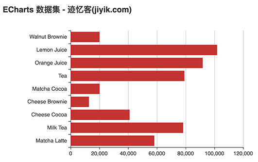
常用图表所描述的数据大部分是"二维表"结构,我们可以使用 series.encode 属性将对应的数据映射到坐标轴(如 x、y 轴):
var option = {
    dataset: {
        source: [
            ['score', 'amount', 'product'],
            [89.3, 58212, 'matcha latte'],
            [57.1, 78254, 'milk tea'],
            [74.4, 41032, 'cheese cocoa'],
            [50.1, 12755, 'cheese brownie'],
            [89.7, 20145, 'matcha cocoa'],
            [68.1, 79146, 'tea'],
            [19.6, 91852, 'orange juice'],
            [10.6, 101852, 'lemon juice'],
            [32.7, 20112, 'walnut brownie']
        ]
    },
    grid: {containlabel: true},
    xaxis: {},
    yaxis: {type: 'category'},
    series: [
        {
            type: 'bar',
            encode: {
                // 将 "amount" 列映射到 x 轴。
                x: 'amount',
                // 将 "product" 列映射到 y 轴。
                y: 'product'
            }
        }
    ]
};
上述代码执行后画出的图形如下所示
encode 声明的基本结构如下,其中冒号左边是坐标系、标签等特定名称,如 'x', 'y', 'tooltip' 等,冒号右边是数据中的维度名(string 格式)或者维度的序号(number 格式,从 0 开始计数),可以指定一个或多个维度(使用数组)。通常情况下,下面各种信息不需要所有的都写,按需写即可。
下面是 encode 支持的属性:
// 在任何坐标系和系列中,都支持:
encode: {
    // 使用 “名为 product 的维度” 和 “名为 score 的维度” 的值在 tooltip 中显示
    tooltip: ['product', 'score']
    // 使用 “维度 1” 和 “维度 3” 的维度名连起来作为系列名。(有时候名字比较长,这可以避免在 series.name 重复输入这些名字)
    seriesname: [1, 3],
    // 表示使用 “维度2” 中的值作为 id。这在使用 setoption 动态更新数据时有用处,可以使新老数据用 id 对应起来,从而能够产生合适的数据更新动画。
    itemid: 2,
    // 指定数据项的名称使用 “维度3” 在饼图等图表中有用,可以使这个名字显示在图例(legend)中。
    itemname: 3
}
// 直角坐标系(grid/cartesian)特有的属性:
encode: {
    // 把 “维度1”、“维度5”、“名为 score 的维度” 映射到 x 轴:
    x: [1, 5, 'score'],
    // 把“维度0”映射到 y 轴。
    y: 0
}
// 单轴(singleaxis)特有的属性:
encode: {
    single: 3
}
// 极坐标系(polar)特有的属性:
encode: {
    radius: 3,
    angle: 2
}
// 地理坐标系(geo)特有的属性:
encode: {
    lng: 3,
    lat: 2
}
// 对于一些没有坐标系的图表,例如饼图、漏斗图等,可以是:
encode: {
    value: 3
}
我们可以使用 visualmap 组件进行视觉通道的映射。
视觉元素可以是:
visualmap 组件可以定义多个,从而可以同时对数据中的多个维度进行视觉映射。
var option = {
    dataset: {
        source: [
            ['score', 'amount', 'product'],
            [89.3, 58212, 'matcha latte'],
            [57.1, 78254, 'milk tea'],
            [74.4, 41032, 'cheese cocoa'],
            [50.1, 12755, 'cheese brownie'],
            [89.7, 20145, 'matcha cocoa'],
            [68.1, 79146, 'tea'],
            [19.6, 91852, 'orange juice'],
            [10.6, 101852, 'lemon juice'],
            [32.7, 20112, 'walnut brownie']
        ]
    },
    grid: {containlabel: true},
    xaxis: {name: 'amount'},
    yaxis: {type: 'category'},
    visualmap: {
        orient: 'horizontal',
        left: 'center',
        min: 10,
        max: 100,
        text: ['high score', 'low score'],
        // map the score column to color
        dimension: 0,
        inrange: {
            color: ['#d7da8b', '#e15457']
        }
    },
    series: [
        {
            type: 'bar',
            encode: {
                // map the "amount" column to x axis.
                x: 'amount',
                // map the "product" column to y axis
                y: 'product'
            }
        }
    ]
};
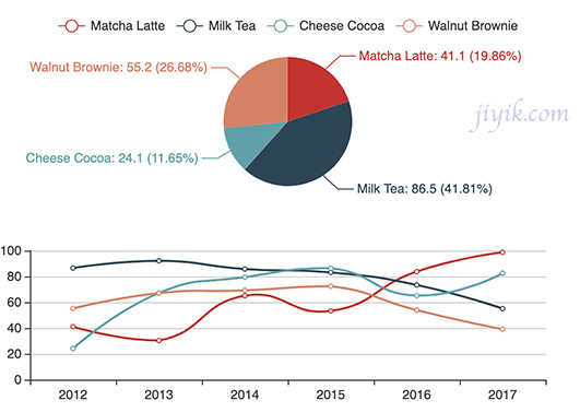
以下实例多个图表共享一个 dataset,并带有联动交互:
settimeout(function () {
    option = {
        legend: {},
        tooltip: {
            trigger: 'axis',
            showcontent: false
        },
        dataset: {
            source: [
                ['product', '2012', '2013', '2014', '2015', '2016', '2017'],
                ['matcha latte', 41.1, 30.4, 65.1, 53.3, 83.8, 98.7],
                ['milk tea', 86.5, 92.1, 85.7, 83.1, 73.4, 55.1],
                ['cheese cocoa', 24.1, 67.2, 79.5, 86.4, 65.2, 82.5],
                ['walnut brownie', 55.2, 67.1, 69.2, 72.4, 53.9, 39.1]
            ]
        },
        xaxis: {type: 'category'},
        yaxis: {gridindex: 0},
        grid: {top: '55%'},
        series: [
            {type: 'line', smooth: true, serieslayoutby: 'row'},
            {type: 'line', smooth: true, serieslayoutby: 'row'},
            {type: 'line', smooth: true, serieslayoutby: 'row'},
            {type: 'line', smooth: true, serieslayoutby: 'row'},
            {
                type: 'pie',
                id: 'pie',
                radius: '30%',
                center: ['50%', '25%'],
                label: {
                    formatter: '{b}: {@2012} ({d}%)'
                },
                encode: {
                    itemname: 'product',
                    value: '2012',
                    tooltip: '2012'
                }
            }
        ]
    };
    mychart.on('updateaxispointer', function (event) {
        var xaxisinfo = event.axesinfo[0];
        if (xaxisinfo) {
            var dimension = xaxisinfo.value   1;
            mychart.setoption({
                series: {
                    id: 'pie',
                    label: {
                        formatter: '{b}: {@['   dimension   ']} ({d}%)'
                    },
                    encode: {
                        value: dimension,
                        tooltip: dimension
                    }
                }
            });
        }
    });
    mychart.setoption(option);
});