扫码一下
查看教程更方便
正如我们在前一章中了解到的,小部件是 flutter 框架中的一切。 我们已经在前面的章节中学习了如何创建新的小部件。
在本章中,让我们了解创建小部件背后的实际概念以及 flutter 框架中可用的不同类型的小部件。
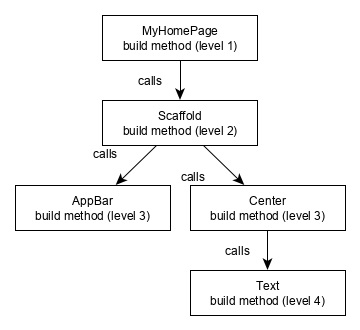
让我们检查 hello world 应用程序的 myhomepage 小部件。 用于此目的的代码如下所示
class myhomepage extends statelesswidget {
   myhomepage({key key, this.title}) : super(key: key);

   final string title;
   @override
   widget build(buildcontext context) {
      return scaffold(
         appbar: appbar(title: text(this.title), ),
         body: center(child: text( 'hello world',)),
      );
   }
}
在这里,我们通过扩展 statelesswidget 创建了一个新的小部件。
请注意,statelesswidget 只需要在其派生类中实现一个方法构建。 build 方法通过 buildcontext 参数获取构建小部件所需的上下文环境,并返回它构建的小部件。
在代码中,我们使用 title 作为构造函数参数之一,也使用 key 作为另一个参数。 title 用于显示标题,key 用于标识构建环境中的小部件。
这里,build 方法调用了 scaffold 的 build 方法,而 scaffold 又调用了 appbar 和 center 的 build 方法来构建它的用户界面。
最后,center build 方法调用 text build 方法。
为了更好地理解,下面给出了相同的视觉表示
在 flutter 中,小部件可以根据其功能分为多个类别,如下所示 -
现在让我们详细讨论它们中的每一个。
flutter 具有特定于特定平台(android 或 ios)的小部件。
android 特定的小部件是根据 android 操作系统的材料设计指南设计的。 android 特定的小部件称为 material 小部件。
ios 特定的小部件是根据 apple 的人机界面指南设计的,它们被称为 cupertino 小部件。
一些最常用的小部件如下
一些最常用的 cupertino 小部件如下
在 flutter 中,可以通过组合一个或多个小部件来创建一个小部件。 为了将多个小部件组合成一个小部件,flutter 提供了大量具有布局功能的小部件。 例如,子小部件可以使用 center 小部件居中。
一些流行的布局小部件如下 -
我们将在即将到来的布局小部件简介章节中详细检查布局小部件。
在 flutter 中,所有的小部件要么派生自 statelesswidget,要么派生自 statefulwidget。
从 statelesswidget 派生的小部件没有任何状态信息,但它可能包含从 statefulwidget 派生的小部件。 应用程序的动态特性是通过小部件的交互行为和交互过程中的状态变化来实现的。 例如,点击计数器按钮将使计数器的内部状态增加/减少 1,flutter 小部件的反应性质将使用新的状态信息自动重新渲染小部件。
我们将在即将到来的状态管理章节中详细学习 statefulwidget 小部件的概念。
flutter 提供了大量的基本小部件,以独立于平台的方式创建简单和复杂的用户界面。 让我们看看本章中的一些基本小部件。
text 小部件用于显示一段字符串。 可以使用 style 属性和 textstyle 类设置字符串的样式。 为此目的的示例代码如下
text('hello world!', style: textstyle(fontweight: fontweight.bold))
text 小部件有一个特殊的构造函数 text.rich,它接受 textspan 类型的子元素来指定具有不同样式的字符串。 textspan 小部件本质上是递归的,它接受 textspan 作为其子级。 为此目的的示例代码如下
text.rich(
   textspan(
      children: [
         textspan(text: "hello ", style:
         textstyle(fontstyle: fontstyle.italic)),
         textspan(text: "world", style:
         textstyle(fontweight: fontweight.bold)),
      ],
   ),
)
text 小部件最重要的属性如下 -
image 小部件用于在应用程序中显示图像。 image 小部件提供了不同的构造函数来从多个来源加载图像,它们如下所示
在 flutter 中加载和显示图像的最简单方法是将图像作为应用程序的资产包含在内,并按需将其加载到小部件中。
flutter:
assets:
- assets/smiley.png
image.asset('assets/smiley.png')
class myhomepage extends statelesswidget {
   myhomepage({key key, this.title}) : super(key: key);
   final string title;
   @override
   widget build(buildcontext context) {
      return scaffold(
         appbar: appbar( title: text(this.title), ),
         body: center( child: image.asset("assets/smiley.png")),
      );
   }
}
加载的图片如下图
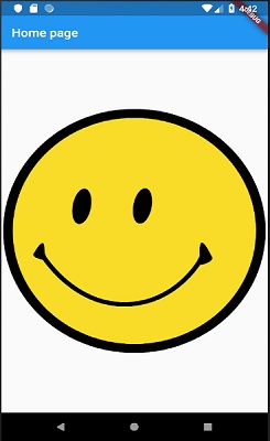
image 小部件最重要的属性如下 -
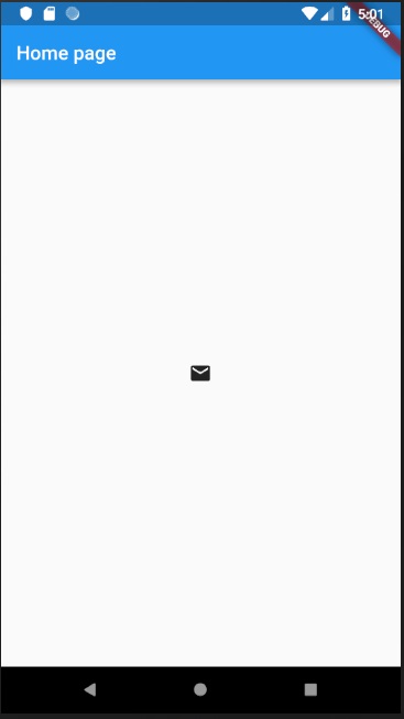
icon 小部件用于显示 icondata 类中描述的字体的字形。 加载简单电子邮件图标的代码如下
icon(icons.email)
在 hello world 应用程序中应用它的完整源代码如下
class myhomepage extends statelesswidget {
   myhomepage({key key, this.title}) : super(key: key);
   final string title;
   @override
   widget build(buildcontext context) {
      return scaffold(
         appbar: appbar(title: text(this.title),),
         body: center( child: icon(icons.email)),
      );
   }
}
加载的图标如下图